Task 3 - Ten elements | Different Art movements.
Sharon Abela & Redd Caruana
As part of my assignment, I had to search and observe diverse examples that merge with the Graphic Desig n industry. What are the objectives? The second part of the presentation, I will be analysing every individual photograph & will explain in detail what period is the type from, what elements & characteristics does it have, what are their properties. how is it being translated, what message is it transferring etc..
Analysing a total of Ten photographs.
Analysing a total of Ten photographs.
Photograph #1 - A Good Conversation Piece
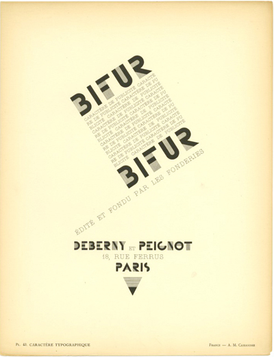
The moment I saw this piece, I could recall the Constructivist movement. Why? Constructivists always had a plan in mind, as it was the era of architecture, everything in order, the less is more, form follows function. The typeface is another state of example, that leads the same path to the constructivist movement. Sans Serif, clean medium characters with a modern finish.
Photograph #2 - BALBI
Can it be Bauhaus or Constructivist ? These two movements were mostly the most important movements at that time, it is only because the Bauhaus had the ideology of Form Follows Function & the Constructivists had the Less is More. The modern touch of the typeface gives away attention, it is justified throughout the boldness of the character & the disciplined cuts that divide the character.
Photograph #3 - Blue Shop
Surreal typeface ? Why ? The surrealists always had that touch of out of the norm, it was not usual, but rather it was mostly juxtaposed & abstract. Although this typeface may not be Constructivist or Bauhaus it still has the touch of modernism in it. Where can we see this ? It is still Sans Serif, it has clean connections with no intention of mixing up the viewer. Contrasting the Blue typeface with the white background keeps the element of Less is more - similarities with the Bauhaus movement.
Photograph #4 - Embassy
The merging of Constructivism & DADA - ? The embassy has this cornered pyramid shaped like architectural building, that indicates several modern movements. Along with the building, the engraved typography is following it's function, it's form generates a solid bold character that holds strongly towards the innovative corner.
Photograph #5 - Erboristeria
A classic elegant shop, that stands out for it's purpose, selling products that are natural.. the typeface abides by the same principles, it is a serif font, this proofs an elegant stature with a curved effect showing a continuous wording. Although it is not a Sans serif type, is has a Roman influence, therefore it has an outstanding figure over every individual character. Personally I found this absolutely interesting due to the fact that it's a white print on glass - this gives the upper hand of elegance and richness, it is purely less is more.
Photograph #6 - NO.43
Art deco style or Nouveau ? Both can add up to this character style, as it shows the pure thin lining of every individual... no fuss is being implemented, it is just less than it is more. Simplicity over powers exaggeration, because it can lead the eye to a great symbol of appreciation. NO.43 found in Valletta, a store that has elegance & simplicity, it is perhaps inspired from the Art Deco era.
Photograph #7 - Ortel
It is most likely to be a traditional grocery shop or if not it may also could have been a barber shop.. Why do I see this ? The way the type is being translated and implemented, adds a touch of non modern type, alas it still has a Sans serif element instead of a serif - this makes it a little bit modern. Simplicity is still abiding by the graphic design rules - there is no exaggeration or whatsoever.
Photograph #8 - Superdry Store
One of the favourites, from all the photographs I took. This sign gives away immediate relevance to what is modern type, what is it translating ? Using Bauhaus to connect the similarities, binding all modern forces together and ending up with a simple and elegant typeface. Similar to the Futura typeface - can this be another Swiss type ? Swiss design was and still is the modern touch of graphic design, many designers use the less is more element with a typeface similar to this Superdry store.
Photograph #9 - Tip Toes
Powerful, Bold & Attractive - seems like a DADA typeface, if it's not similar than how about constructivist or Suprematist ? Combining forces together, the use of Sans Serif & Serif font - I think this Tip Toes type has both, there are slight macro bits where we can find a serif character (S) ?
Photograph #10 - LOADING SIGN
A loading sign is a strategic form of simplistic communicative visual, that people are automatically observing them whenever they go. Why is this ? It has bold characters, shocking colour - Yellow (original), San Serif characters. Opinion minding to say that this typeface can be merged together with some DADA influence, with it's boldness and even the texture found running around onto each individual character.


_Gertie_the_Dinosaur_-_Gerite_carries_MccCay_in_her_mouth.jpg)
.jpg/revision/latest?cb=20091023164254)